What Makes the 2025 Rolex Super Clone Releases Feel More Mature — A Personal Breakdown
I spent some time last week revisiting a few of the Rolex replicas released in 2025, mostly because the improvements people mentioned sounded a bit vague to me. But after spending a few days looking at them side by side with last year’s versions, the differences start becoming clearer. They’re not loud differences. Nobody reinvented the wheel. Instead, this year feels calmer—like the factories finally decided to stop trying to shock everyone and instead focused on the parts that actually matter in daily use.
One thing that stood out immediately was the brushing. If you’ve handled enough replicas over the years, you know that brushing is usually where you notice shortcuts. Slightly too bright, or grain too wide, or direction not consistent. The 2025 batches feel more composed. Not perfect, but more balanced. Like someone actually took a moment to evaluate the tone rather than just finishing the case quickly.
The Oyster bracelets also feel different. Older batches sometimes moved too stiffly, or swung too loosely, almost like the adjustment was guessed rather than measured. But this year’s bracelets swing with a smoother rhythm. You feel it the moment you tilt the watch from side to side—the links behave more like they’re meant to behave, without that hollow rattle older replicas sometimes had.
I also noticed something in the ceramic. There’s always been a slightly artificial look in some replica ceramics—too glossy or too flat. But the new 2025 batches have a tone that settles more naturally under indoor lighting. The colors look more assured and less plastic-like. It’s not something you’d appreciate immediately unless you’ve compared many replicas over time, but it’s one of those improvements that adds up.
For models like the GMT-Master II, the blue-red and black-blue ceramic blends show clearer transitions. The blue doesn’t look washed out, and the red doesn’t bleed into purple the way some older versions did. Subtle but noticeable.
The dial printing feels cleaner too. Not sharper. Sharper is easy; overly sharp actually looks fake. I mean cleaner in the sense of spacing and tone. The fonts sit better. The lume doesn’t pool awkwardly at the edges. The whole dial feels calmer.
If you’re curious about which models this applies to, here are a few impressions from the ones I spent time with:
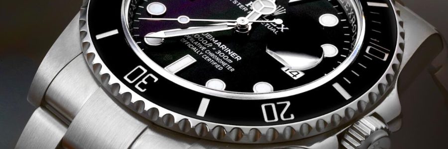
1. Rolex Submariner 126610LN (Clean Factory)
The ceramic black looks more controlled this year, and the brushing transitions smoother around the case. The clasp action feels more stable too.
2. Rolex Submariner 126610LV (VStar)
The green tone doesn’t fight for attention. It feels softer and more natural than some earlier “too bright” versions.
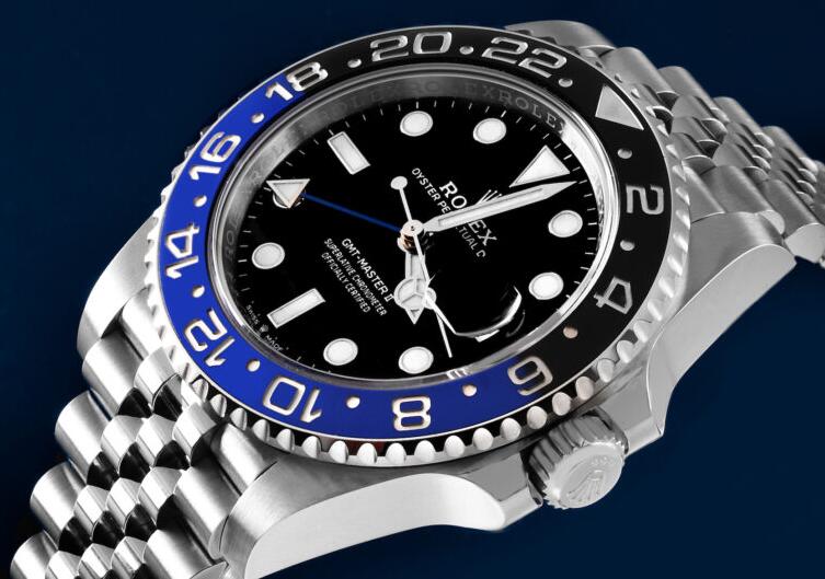
3. Rolex GMT-Master II Batman (Clean)
The blue settles more evenly under soft light. Bracelet flexibility is noticeably better.
4. Rolex GMT-Master II Pepsi (BT)
The ceramic blend feels more balanced. The red-blue separation looks cleaner.
5. Rolex Datejust 41 (VS Factory)
The sunburst dials look smoother. Earlier versions sometimes scattered light inconsistently—this year looks calmer.
6. Rolex Yacht-Master 40 (VS Factory)
The platinum-tone bezel surface feels closer to genuine. The reflection changes more naturally depending on angle.
7. Rolex Day-Date 40 (BT Factory)
The metallic tone feels warmer and more familiar. The markers sit more evenly.
Why 2025 Feels More “Mature”
What I’ve noticed is that factories this year focused on “feel” rather than obvious visual upgrades. The pieces behave better—bracelet movement, clasp feedback, dial tone, ceramic consistency.
These aren’t improvements that scream. They’re improvements that feel.
And honestly, that’s a better direction for long-term quality.
For anyone who wants a structured comparison across multiple 2025 releases, there’s a detailed breakdown here:👉 rolex super clone
It outlines the differences in a way that matches what I’ve seen personally.
Seeing these quieter refinements makes me think factories finally understand that realism comes from harmony, not sharpness or brightness. And that’s why 2025 feels like a turning point—slow, subtle, but meaningful.